Friday, 8 April 2011

7. Looking back at the preliminary task, what do you feel you have learnt in the progression into a full product?

In creating my music magazine I have acquired some useful skills and some skills that I have previously possessed have been nurtured. There were many tasks I had to undergo before making my magazine including planning and research and other things I did not expect to do. Doing this all independently helped me with my time management and organisational skills. I had to decide on who I wanted to use as models for my magazine, plan and arrange suitable times for all of us so that I could take my photographs.
Constructing my front cover and contents page was slightly more straightforward as they are both A4 canvases but when I was going to start producing my double page spread I had to open a new file, use an A3 canvas and rotate it 90 degrees. By doing so, the page became landscape which is what I wanted. Evidently I have learnt quite a fair amount about Photoshop considering I had never really used it before. Two very useful things I’ve learnt are how to place an image onto a canvas and how to move an image from one canvas to another.  
I chose my font cleverly and strategically. When I decided on the genre of my magazine and what I would call it, almost immediately I had an idea of the type of font I’d use. I wanted something swirly but not too fancy that it’d be illegible. Also, I knew that I’d use the Times New Roman font as this is my favourite font and it looks decent and elegant. I understand how important it is to pick the right and most suitable fonts as fonts tend to have a key impact on the reader and how they perceive the product. A font can determine whether a potential consumer buys (or reads) a magazine or not.
Ultimately, creating my three pieces and all the pre-production and post-production tasks has taught me the importance of evaluating my work. Evaluating makes you think about what you did and why you did it, this enables you to see what you could do next time to improve your work.

6. What have you learnt about technologies from the process of constructing this product?


Producing my magazine was the first time I actually used Photoshop expansively. Before I had just used Photoshop to copy and paste things but for my magazine I learnt many more useful things about the software. My teachers and fellow class mates helped me navigate particular features of the software and I also taught my self by just practicing and working independently. Photoshop was the best software for constructing and designing my music magazine and learning how to use basic tools was very helpful to me.
As pre-production to making my magazine, there were a number of various equipments and technical devices I used. In the studio were I took all my pictures these are names of some of the apparatus’ I used: a Bawens Gemini Espirit GM500 Flash, Bawens radio trigger, 60cm Soft box, Circular reflector (for some photos) and of course the camera a Canon Eos 400d.


Canon Eos 400d


60cm softbox
 Bowens Gemini Espirit GM 500 flash


After gathering my models, we went to the studio and took pictures. I had a few props microphones and sunglasses. These were really suitable as they are things that can be associated with music and music artists. Also, I brought the props to diversify the look of my pictures as I knew I was going to take all my pictures in the studio. I chose to do this as I liked the look of the dark blue background in the studio. All my pictures were taken with a Canon Eos 400d even the ones that were not included in my magazine. Using this camera was not too difficult for me, learning how to take pictures that were in focus was what I struggled with at first but soon after I mastered it. To achieve the best possible photos I had to make sure I kept a steady hand when taking my photos because if you move the camera quickly, the pictures end up looking indistinct.  I made sure I took a range of different shots including medium and long shots, portrait and landscapes, two shots and single shots of my models and medium close up shots.


Landscape
Portrait
When I had taken a good thirty photos, I was given a card reader to insert the memory card into. After I had done this and I had saved my pictures onto My Desktop I began to look through my pictures to find potential ones worth including in my magazine. As the majority of my pictures came out really well and I had various poses of my models, at first it took me a long time to decide on which pictures to use. I asked a few people on what pictures they liked best and this helped a little bit. Once I had whittled my photos down to ten potentials I used ‘Microsoft Office Picture Manager’ to make any necessary alterations e.g. crop and auto brightness.  


Before 'Auto Brightness'
After 'Auto Brightness'

Subsequently after, I started work on my music magazine front cover. I placed a long shot image of my models as my front cover image. Using toolbars like the ‘Type Tool’ was simple and I used it to type my masthead, cover lines etc. I also used this tool on my contents page and double page spread. On all three of my pages (front cover, contents page and double page spread) I had to use the ‘Move Tool’ to obviously move images, textboxes etc around. Photoshop is a very complex software (especially for a beginner) so I didn’t do anything too complicated. This was alright for me as I wanted to go for a simple look with my music magazine.

'Type tool'
'Eye dropper tool'
'Move tool'

For my front cover I needed to insert a barcode as this is something that is standard so I used the famous search engine ‘Google’ and got images of barcodes I selected the one I wanted, saved it as a picture on my computer and then opened it in Photoshop, moving it to where I wanted with the ‘Move Tool’. 
As the backgrounds of all my photos were very dark blue/black I didn’t have to colour the background of my front cover. I simply used my photo to cover the whole page. My contents page and double page spread however had to be filled with a background colour and I picked black. Whilst creating my three pieces I made sure that I used constant fonts, Times New Roman and Mistral fonts that were legible and sophisticated. To make my masthead, cover lines, headline, by line and selling line look more noticeable I added effects to them e.g. around my headline on my double page spread, effects like ‘Drop Shadow’ and ‘Bevel and Emboss’. To get the same orange colour on all three of my pieces I used the ‘Eyedropper Tool’ which matched the orange colour and make things look professional and even.

Effects used: Drop Shadow, Inner Shadow and Bevel and Emboss


To make sure the sizes of my texts on all three of my pieces were of suitable size, I printed off hardcopies of my pieces.

Printscreen of my completed front cover in Photoshop


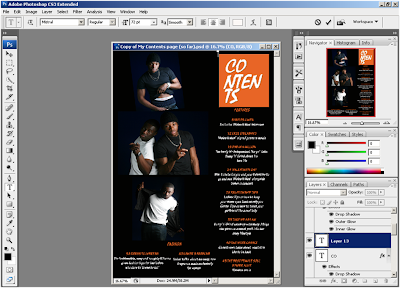
Printscreen of my completed contents page in Photoshop


Printscreen of my completed double page spread in Photoshop

Wednesday, 6 April 2011

5. How did you attract/ address your audience?

To make my music magazine look attractive and appealing to my target audience. I used a sophisticated and calm colour scheme. A deep orange, black and white were the colours used. On my front cover I used two black male models who represented an R ‘n’ B and soul duo I created (for my magazine) ‘Males II Men’. The lighting is low-key which makes the two guys look both relaxed yet sensuous at the same time. The two young men are wearing plain t-shirts, one black one white, this was done deliberately to go with my colour scheme and to add to my magazines’ simplicity. Both of my models are looking directly at the camera thus making it look like the artists are staring and connecting with the consumer.
The cover lines I included on my music magazine front cover were placed deliberately to entice my audience.  In the top left corner of my front cover I placed a ‘BUY ME NOW VALENTINE SPECIAL!!’ cover line to persuade the reader to buy now highlighting how this edition is a special one. In my main cover lines I also included a snippet of some of the exclusive things available inside.
In addition, I mentioned the freebies available inside. This is a strategic device that works and this is evident in my audience research questionnaire results. People like freebies and it helps them decide whether to purchase a product or not. Using famous names like Usher and Amerie who are both American singers and songwriters of the same R ‘n’ B music genre will particularly appeal to my target audience. On the right hand side of my magazine, in the centre I placed a ‘Celeb Confessions’ cover line which acts as a teaser stating that you can find out which of the duo is dating the sexy R ‘n’ B singer, Keri Hilson.

Along the bottom of my magazine front cover, I included a selling line ‘ENTER OUR COMPETITION & WIN EXCLUSIVE USHER TICKETS!’ This is also a device used to entice possible consumers.
My contents page also includes images of the duo; this will be particularly engaging to females as they may find the men attractive.
My double page spread includes images of the duo so that it looks like an interesting read. Also I think that the use of various images makes my double page spread look very striking.
This is the second  side (left page) of my double page spread
The tone I used is light hearted and I generally used an informal register even though I used Standard English. If I had used some colloquial speech it would have been quite appropriate as the use of slang is recognizable in R ‘n’ B music. It is not particularly a posh upper-class music genre but one that is more urban and street.
In my magazine I actually did not mention particular places this was done for a few reasons. I had not decided whether I wanted my magazine to be for an English audience only or an American one. So, by not mentioning names I hoped that that would depict my media product’s versatility, a magazine that’s for both an American and English audience.
Selecting a suitable font was not too difficult as I had an idea of the type of font I wanted to use. I had chosen the genre and name of my magazine so I had to find the font(s) I found most suitable. I wanted a sharp and edgy type of font that looks slick to match ‘Bump ‘n’ Grind’, the name of my magazine. Bradley Hand ITC, Edwardian Script ITC and Freestyle Script are just some examples of the fonts I thought would be suitable. I decided on the font called 'Mistral' in the end:

Baseball caps, hats, sunglasses, ‘bling’, tight fitting t-shirts and jeans which is the typical young, male dressing of R ‘n’ B artists. Men and young guys that try and emulate R ‘n’ B and rap artists’ especially American ones. My models were chosen on purpose, guys that have a particular strong build (broad shoulders, nice abs etc) and have a distinct if not an attractive face (or features). The models are posing in a ‘we’re in control’ manner. I also used props like microphones and sunglasses.  
Last but not least the least, the price of my magazine £3.95 is quite reasonable in comparison to some music magazines e.g. The Guitarist which is £5.50.

Tuesday, 5 April 2011

4. Who would be the audience for your media product?

‘Bump ‘n’ Grind’ targets a global audience though it mainly centres on the British and American people. This is because they are the musical initiators and most of the mainstream artists and bands featured and promoted in this music magazine originate from both countries (especially America).
I decided that the main audience for my media product will be roughly 17-30 year olds. This is because I believe that people between this age range will more likely be the passionate followers and listeners of the R ‘n’ B culture. Although, people older than 30 will find my magazine entertaining as it’s definitely more of a mature read also the soulful music will be quite alluring to the older generation(s).
My magazine is not specifically targeted at a particular gender hence I stayed away from colours like blue and pink.
Although my magazine aims to target all races, the main demographic of my music magazine will be the Afro-Carribean audience as R ‘n’ B and soul originate from the Nubian population (See my mood boards).

My magazine targets people that are into their soul and R ‘n’ B music. People that regularly go to music concerts, gigs and even people that make music themselves will be interested in my magazine too. Some of them will also be into music technological devices such as music players (e.g. mp3 and mp4 players), headphones (brands such as Beats by Dr Dre and Skullcandy) and music related fashion (designers such as G-Shock watches and Bape).

‘Bump ‘n’ Grind’ completely targets the ABC1 social class.

3. What kind of media institution might distribute your media product and why?


I decided that the publishing house I wanted to distribute my magazine would be Condé Nast publications. There are various factors that helped me come to my decision. For instance, the fact that Condé Nast does not have a magazine similar to mine means that as well as attracting a new audience, there will be no major competition with their other magazines. Generally their magazines target and are distributed to people of a higher class to my target audience, thus bringing in revenue from another audience. By publishing my magazine, Condé Nast will gain recognition from an even wider audience.
The main audiences of Condé Nast magazines are middle aged, middle classed people that enjoy reading lifestyle magazines. This contrasts with my magazine which is not only for the working class but it is also for young, urban music lovers. Having a magazine like my own will place Condé Nast in a positive and respectable position in the eyes of my target audience. This is because people of the working class will not be able to feel like this publishing house is discriminatory against them. Each of this publication company’s have specific magazines targeted at specific demographic, mine being mainly people that are interested in soul and R ‘n’ B music. My magazine will be able to make a substantial amount of profit as there will be no competition between the company.
Vogue, Brides and GLAMOUR are examples of some of the lifestyle magazines Condé Nast publish. My magazine will be a noteworthy investment for the company as they have nothing similar to my magazine, this will widen their audience. In addition, my magazine is of comparable standard and superiority with that of Condé Nast magazines.

My magazine will be distributed at local newsagents and supermarkets all over the country as many famous magazines get distributed this way. Distributing my magazine this way is faster and makes things easily accessible for my audience. Similarly to the way present Condé Nast magazines are distributed I will have my magazine available to purchase/subscribe on the internet, I will have a website and mobile phone services for my magazine. This way my magazine will be easily accessible to my audience -specifically my target audience.
As my magazine gets recognition and it becomes successful I will work on distributing it all around the world.


Sunday, 3 April 2011

2. How does your media product represent particular social groups?

The music genres my magazine focuses mainly on are soul and R ‘n’ B. My magazine does include elements of other genres e.g. gospel and rap however, soul and R ‘n’ B are the key themes.
The models on my front cover are represented as typical males in the soul and R ‘n’ B industry. They are both wearing t-shirts that show off their arms and their abs. Thus conveying their strength, boldness and sexiness (women will be the ones who will tend to think this). The model on the right is wearing a white Bape G- shock watch which is popular in the rap, gangster community. Expensive looking Rolex watches are also famous too. Famous names like Kanye West, Drake, and Jay Z are amongst the countless artists that own some. The model on the right is also wearing chains ‘bling’ and an earring (which is not evident in the image) whilst the other model sports an arm chain. The jewellery the models are wearing connotes both affluence and status. What's more, the model also holds onto his belt drawing more attention to the fact that it is designer (the prestigious Dolce&Gabbana) and therefore most likely expensive. Valuables like this are common on artists featured in music magazines especially hip-hop, R ‘n’ B and other similar genres as these are the sort of accessories they tend to wear. Thus insinuating people that are followers of these music genres see wealth as important and aspire to get it.
The way my models are posing shows they are confident and certain of whom they are and this is how males in the R ‘n’ B industry tend to be represented as hard.
Noticeably, they are not as extravagantly and luxuriously dressed up as famous celebrities but I believe they do depict the genre of music I was going for. Also the overall simplicity of their dressing mirrors the subtle and simple look I was going for with my magazine.
On my contents page, I have also used the same models but they are striking different poses. I used the same models (the soulful, R ‘n’ B duo ‘Males II Men’) to communicate the idea that my magazine was a Valentine’s Day special but also a Males II Men tribute.
The picture at the top is of one of the pair leaning to one side, lifting his t-shirt up so that some of his packs are on show. This is a seductive pose that is clearly aimed at the ladies. This was done deliberately as some women will buy the magazine just to get a good look at the good looking guys’ body. The free posters inclusive were definitely aimed mostly at my female audience.  
                                     
The picture I placed in the centre was done as I like the image and the lighting. Also I included it to symbolise the togetherness of the duo (who are meant to be brothers). They are both pointing at the camera and this pose is quite ‘gangster’ but could also appeal to the females as well as it may be perceived as sexy.


This image at the bottom is of the second young artist. His pose is
different to his brothers however he also leans to one side (the
opposite side to his partner). He has on a black coat that he opens
and he also appears to be biting his bottom lip also in a manner that many females may find flirtatious.